5 things you should master if you want to start as UI/UX designer

Learn these five essential elements to kickstart your career as a UI/UX designer.
It's Typography, but why?
Why Typography? Well, the reason is that a significant portion of digital content, if not more than 50%, is composed of textual components. So, there are at least 5 Typography elements you need to know:
- Font size
- Font weight
- Spacing
- Contrast
- Hierarchy
Let's examine these examples. There are mostly textual components:


This means gaining mastery in Typography prepares you to excel in UI design.
What does Typography entail?
It involves utilizing text effectively to provide a meaningful user experience to the users.
This image shows a website that uses text with uniform color, size, and weight.

Meanwhile, this is another example of a website displaying proper text with different colors, sizes, and weights.

Though the textual information remains identical, which version appears more visually appealing and offers enhanced readability? It must be the second one.
This is the essence of Typography in UI design.
1. Font size
It's about which kind of text should ideally be more significant or big, and which should be in regular or smaller sizes.
We'll inspect Surshark.com and review various font sizes present on this page.

Right-click on any text you want to inspect its CSS class.
Here is the result:
- Menu - 1.4 rem / 22.4px
- "Your safer digital everyday" - 8.8rem / 140.8px
- "Surf the web without tracking with a VPN, shield your devices with Antivirus, & guard your identity with an all-in-one app." - 1.8rem / 28.8px
- "Get Surfshark" button - 1.6rem / 25.6px
Why are the text sizes different?
- Every text has its own priority and function. For instance, the largest-sized text (140.8px), often used for titles, is ideal for a significant message and needs to be seen clearly. It has the first priority and primary focus of the page.
- The next text is the subtitle (28.8px) tells more about the title with a short description. It represents the second-largest text, signifying the secondary focus.
- You can see menus are at the top section, using the smallest size (22.4px). Meanwhile, the "Call to Action" button stands slightly larger (25.6px) than the menus and slightly bold to capture the readers' attention.
- These messages are vital to be visible clearly to gain the readers' trust in the idea that Surshark is giving hope to solve their problem with privacy.
2. Font Weight
Font weight is when you want to use regular, bold, or medium text. Let's take a look at the variety of font weights being used here:

- "Cultivate Mindfulness: Live in the Present" - font-weight 600 / Semi-bold
- "Vestibulum vehicular dui venenatis neque...... " - font-weight 400 / Regular
- "Updated on June 20, 2023" - font-weight 500 / Medium
Another example:

- "X" / account name - Bold
- "@X" / username - Regular
- "more words......." / tweet content - Regular
- "4.00 AM Feb 9, 2023 " / date and time - Regular
- "40.8M" / views - Bold
- "10.9K, 15. 9K, 109.7K, 2,249" - Bold
- Repost, Quotes, Likes, and Bookmarks - Regular
Key points
- The use of varying text thickness is intended to highlight more important information.
- Not all important information has to be bold. It all depends on the surrounding elements. Some important information may use regular text, while other surrounding information might utilize smaller-sized and gray text.
3. Spacing
Spacing is how to have an ideal letter and line spacing to make the content proportional. To understand the significance of text spacing, let's take a look at the images below:

Tight line spacing
- Title - 20px
- Description - 18.5px

Ideal line spacing
- Title - 30px
- Description - 25px
- Proper line spacing makes it easy and clear to read.
Letter spacing
When it comes to letter spacing, don't make it too tight, and don't make it too wide. Being too tight makes it difficult to recognize each letter, and being too wide makes it hard to read.

- "PLAYER" - ideal (1px)
- "Andre Onana 24" - too tight
- "Luke Shaw" - ideal (0.5 px)
- "Antony" - too wide
For capital text, the spacing between letters should actually be a bit wide. This is because capital text has consistent letter heights.
For lowercase text, the spacing between letters shouldn't be too wide.
4. Contrast
Color contrast is another important element to improve your page readability and user experience. This applies to small and large text.
Try to achieve an optimal contrast ratio between text and background within your design.


You can use these contrast checkers to determine whether your selected colors display enough contrast:
 Realtime Colors
 Coolors.co
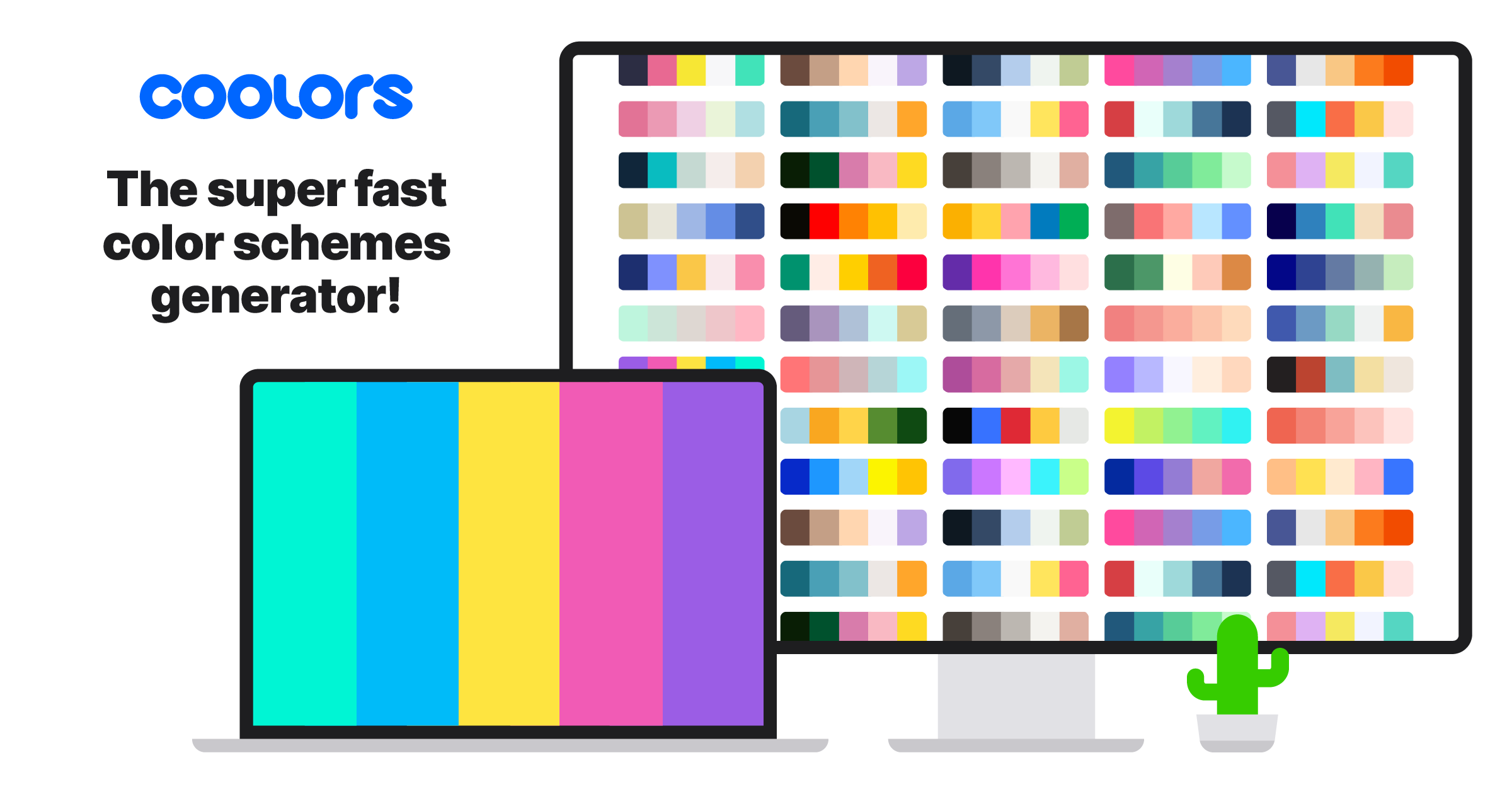
5. Hierarchy
The final element is the hierarchy. In essence, it refers to levels or ranks. Therefore, visual hierarchy entails integrating visual levels to enhance the readability of information.
It is typically determined by the priority of the information on the page.
- Size hierarchy (font size)
- Thickness hierarchy (font-weight) - Light, Regular, Medium, Bold
- Color hierarchy (font color)
Usually, the more important the information, the larger its text size, the thicker its weight, and the deeper its color.


Here are the changes in the second image that makes it look more readable and visually appealing.
- Implemented spacing adjustments
- Modified the title size and introduced font-weight
- Included a shape for the tag word
- Reorganized the writer and date names and changed the font color
The design at the top uses text with the same thickness, the same color, and the same size. It becomes difficult to distinguish the information. You have to read each one separately to determine details like title, description, and others.
Meanwhile, the design below exhibits excellent visual hierarchy. We can quickly determine its title because the text size is large, and its thickness is distinctive (Bold), putting it apart from the other text.
How to have a strong visual hierarchy
- Create a prioritized sequence of information and elements, starting from the most important to the least important.
- Make less important information and elements less prominent.
- Highlight the most vital information and elements, either through the use of bright colors or large sizes.
And there you have it!! I hope you've gained something valuable from this article.
People heavily rely on the first piece of information they see and make subsequent judgements influenced by it - Canvs Editorial
UI Resources
 Stack Sorted.
 Realtime Colors
